When a record-breaking heat wave rolls through, or a “once in a century” flood hits twice in a decade, a natural question pops up: is this just bad luck, or a sign of a changing climate? Climate scientists answer that by doing something surprisingly down-to-earth. They count. They measure. They compare. And, most importantly, they keep careful track of how the measurements were made.
Tracking extreme weather trends is like keeping a long-running health log for the planet. One high fever does not diagnose a chronic condition. But a pattern of rising baseline temperature, more frequent spikes, and longer recovery times tells a bigger story. Here is how scientists build that story using real-world data, and how they separate individual events from long-term patterns.

The big idea
Weather is what happens day to day. Climate is the statistical picture that emerges when you look across decades. Extremes sit at the tail ends of that picture.
Scientists typically track extreme weather using two complementary approaches:
- Event analysis: What caused this heat wave, flood, or storm, and how unusual was it?
- Trend analysis: Are heat waves, heavy rain days, droughts, or intense storms changing in frequency, intensity, duration, or location over time?
Doing this well requires three ingredients: long records, consistent definitions, and multiple independent data sources that can cross-check each other.
Where the data comes from
No single instrument watches the whole planet perfectly. Instead, climate scientists stitch together a “quilt” of observations, each with strengths and blind spots.
1) Weather stations
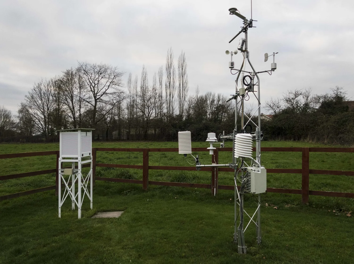
Thermometers, rain gauges, anemometers, and pressure sensors at weather stations provide the most direct, local measurements. Many national meteorological agencies have station records going back decades, and in some places more than a century.
- What they’re great at: Daily temperature highs and lows, rainfall totals, and wind observations with local detail.
- Common limitations: Stations move, cities grow around them (urban heat effects), instruments change, and coverage is uneven across remote regions.
To make fair comparisons across time, scientists use homogenization: statistical methods that look for non-climatic shifts (for example, a sudden jump caused by a station relocation or instrument change). Depending on the dataset and goal, those shifts may be adjusted, flagged, or used to quantify uncertainty. Many archives keep both raw and homogenized series, and different methods can produce slightly different adjustments.
2) Satellites
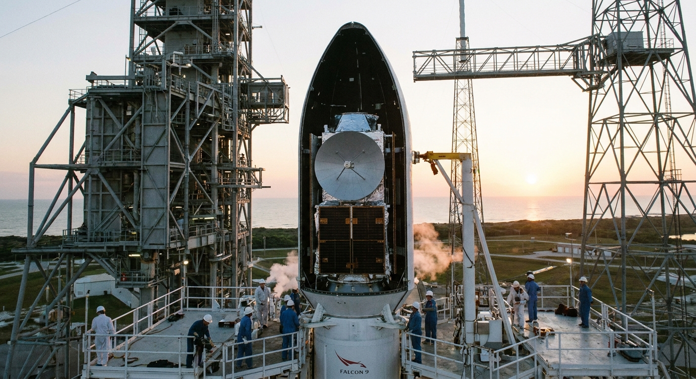
Satellites are like a planet-spanning set of senses. They do not usually “feel” temperature the way a thermometer does. Instead, they measure radiation and infer quantities like cloud properties, sea surface temperature, atmospheric moisture, vegetation stress, and precipitation.
- What they’re great at: Consistent global coverage, especially over oceans and sparsely monitored land areas.
- Common limitations: Satellite instruments change over time, orbits drift, and converting radiation into rainfall or temperature requires careful calibration.
3) Radar
Weather radar tracks precipitation by sending out radio waves and measuring what bounces back from raindrops, snowflakes, or hail. For extreme rainfall and severe storms, radar is invaluable because it captures intensity and structure, not just daily totals.
- What they’re great at: Short-duration downpours, storm tracking, hail signatures, and local rainfall patterns.
- Common limitations: Radar coverage varies by country, mountains can block beams, and the record is often shorter than station archives.
4) River gauges and streamflow networks
Floods are not just about rainfall. They are also about snowmelt, soil moisture, dam operations, land cover, and where the water can go. River gauges measure water level and flow, creating a historical record of how rivers respond to storms and seasons.
- What they’re great at: Direct evidence of flood magnitude and timing in a watershed.
- Common limitations: Gauges can be damaged in major floods, and river engineering can change the flood behavior over time.
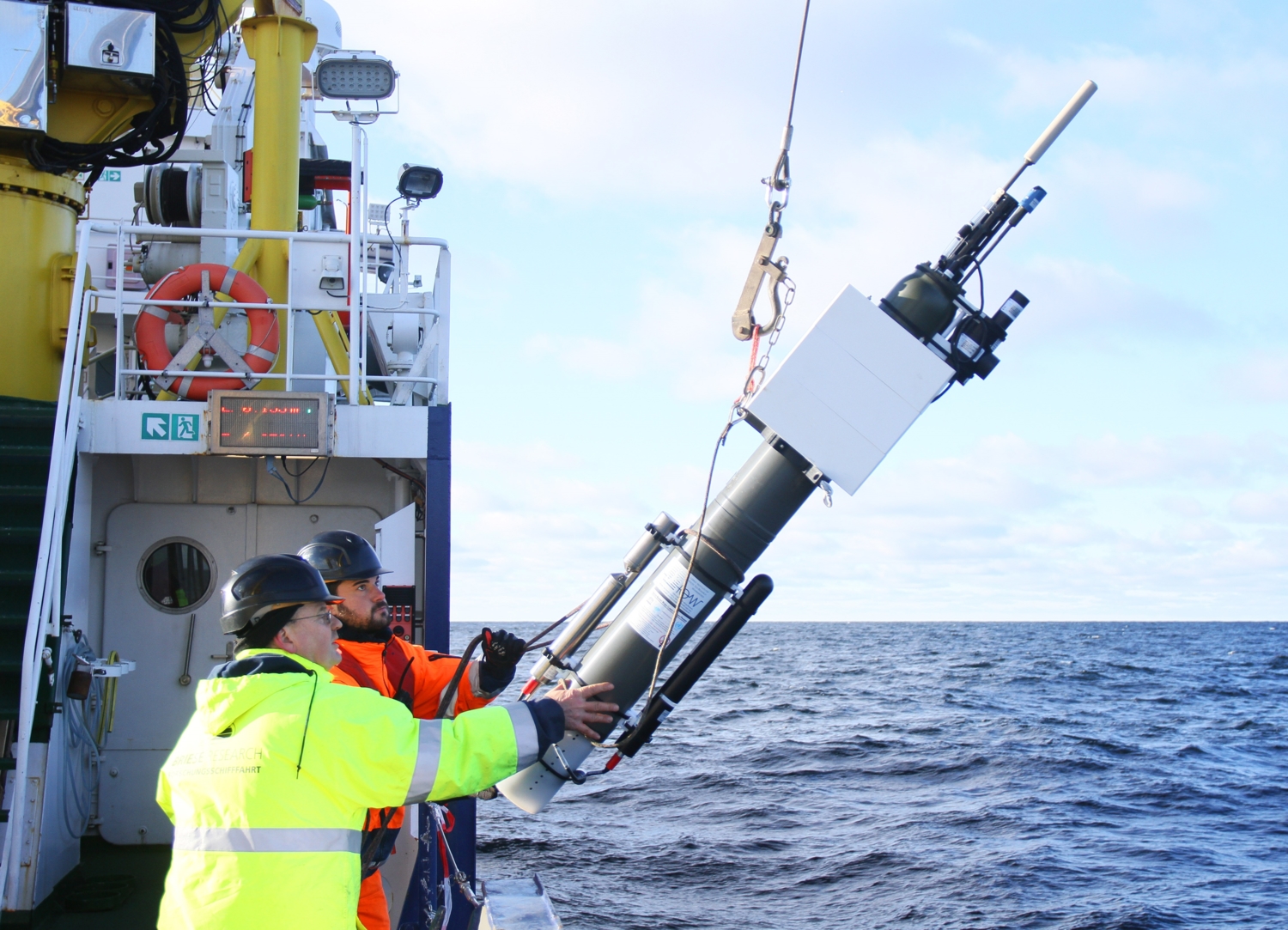
5) Ocean observations
For hurricanes, marine heat waves, and coastal extremes, the ocean matters. Scientists use moored buoys, drifting buoys, ship observations, and the global Argo float network to monitor ocean temperature and salinity down to about 2,000 meters (with newer, more limited Deep Argo extending deeper in some regions).
- What they’re great at: Sea surface temperature, ocean heat content, and conditions that fuel or suppress tropical cyclones.
- Common limitations: Older ship-based records can be inconsistent, and deep historical ocean coverage is sparser than modern networks.
6) Reanalysis
One of the most useful tools you will hear about is reanalysis. Think of it as a weather model that is repeatedly pulled back toward reality using observations from stations, balloons, aircraft, and satellites. Technically, this is done through data assimilation. The result is a complete, gridded dataset of atmospheric conditions over time.
Common examples include ERA5 (ECMWF) and MERRA-2 (NASA). Reanalysis is especially helpful for analyzing patterns like jet stream shifts, atmospheric rivers, and heat-dome circulation, even where direct observations are sparse. One caution: reanalyses are not pure observations, and they can show spurious shifts when observing systems change (especially across the pre-satellite to satellite era), so researchers often validate trends against station data and other independent products.
7) Paleoclimate proxies
For perspective on rare extremes, scientists sometimes look beyond instruments using proxies such as tree rings (drought and temperature sensitivity), ice cores, corals, and lake sediments. These are not day-by-day weather logs, but they can reveal whether recent extremes sit outside the bounds of natural variability over centuries to millennia.
What counts as extreme
“Extreme” sounds dramatic, but in climate science it usually has a practical definition: a value that sits far out in the statistical distribution for a location and time of year.
Two families of indicators show up again and again:
- Threshold-based: Exceeding a fixed mark, like 100°F (37.8°C) or 50 mm of rain in a day.
- Percentile-based: Exceeding something like the local 95th or 99th percentile for that date, which helps compare places with very different climates.
Heat waves
Heat extremes are not just about one scorching afternoon. Scientists track intensity, duration, nighttime relief, and humidity because those factors drive health impacts. They also increasingly look at exposure, such as population-weighted heat, because a severe heat event matters most where people actually live and work.
- TXx: Hottest daytime high in a year (annual maximum of daily maximum temperature).
- TNx: Warmest night of the year (annual maximum of daily minimum temperature).
- Warm spell duration: Number of consecutive days above a high percentile threshold.
- Heat index or wet-bulb metrics: Combine temperature and humidity to estimate physiological stress.
Heavy rainfall and floods
Flood risk is tied strongly to short bursts of intense rainfall, not just monthly totals. That is why scientists track things like the wettest day or the wettest 5-day period. Why it matters: infrastructure often fails on peak intensity, and watersheds respond differently to a one-hour deluge than to a week of steady rain.
- Rx1day: Wettest 1-day precipitation total each year.
- Rx5day: Wettest 5-day total each year.
- R95p / R99p: Total rain falling on very wet days (above the 95th or 99th percentile).
- Streamflow peaks: Annual maximum river discharge, often used in flood frequency analysis.
Drought
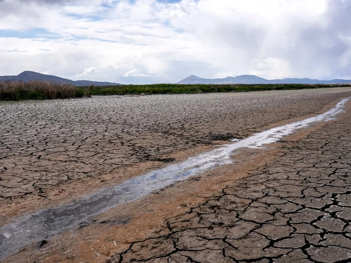
Drought is slippery because it depends on what you care about: crops, reservoirs, ecosystems, wildfire risk, or groundwater. Scientists use multiple drought indicators to capture different “flavors” of dryness. Why it matters: the same rainfall deficit can produce very different impacts depending on heat, wind, soil conditions, and water management.
- SPI (Standardized Precipitation Index): How unusual precipitation is over a chosen time window (1 month, 6 months, etc.).
- SPEI: Like SPI, but includes atmospheric demand for water (often tied to temperature and evaporative conditions).
- Soil moisture anomalies: From in situ probes, satellites, or land models, crucial for agriculture.
- Palmer Drought Severity Index (PDSI): A classic, simplified soil-water balance index that uses precipitation and temperature, but also carries strong assumptions and regional limitations, especially outside the areas it was originally designed for.
Storms and tropical cyclones
For storms, the metric depends on the storm type. Many of the biggest real-world impacts come from compound drivers, like extreme rainfall plus storm surge, or heat plus drought priming a wildfire season.
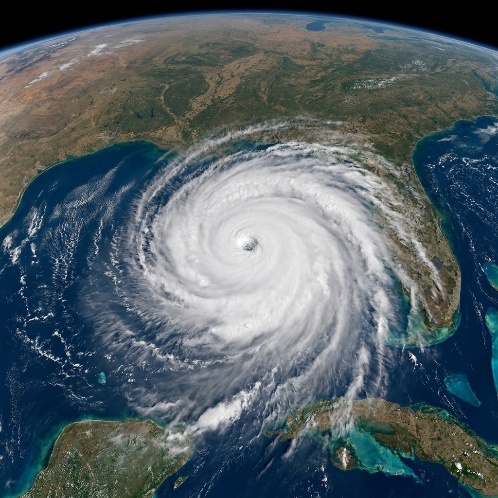
- Hurricanes and typhoons: Maximum sustained wind, central pressure, rainfall, and rapid intensification events. (One nuance: “maximum sustained wind” is not measured the same way everywhere. Some agencies use 1-minute averages, others use 10-minute averages, which complicates cross-basin comparisons.)
- Severe convective storms: Hail size, tornado occurrence, and damaging wind reports, though reporting practices can complicate trends.
- Extratropical cyclones: Pressure depth, wind extremes, and storm track shifts.
A key dataset for tropical cyclones is the IBTrACS archive, which merges storm track information from multiple forecasting centers into a more standardized global record.
Common datasets
If you ever peek into a study or a public climate dashboard, these names pop up often. They are not the only options, but they are common workhorses.
- NOAA GHCN (Global Historical Climatology Network): Long-term station observations used widely for temperature and precipitation analyses.
- Berkeley Earth: A global land temperature dataset that emphasizes transparent methods and broad station inclusion.
- HadCRUT and NOAA global temperature products: Blended land and ocean temperature estimates for global trend tracking.
- ERA5 (ECMWF): A high-resolution atmospheric reanalysis used for heat, wind, humidity, and circulation patterns.
- MERRA-2 (NASA): Reanalysis with strong ties to satellite-era observing systems and aerosol information.
- CHIRPS: Satellite-gauge blended rainfall, popular for drought monitoring in data-sparse regions.
- GPM and TRMM: Satellite precipitation missions used to estimate rainfall intensity and structure globally.
- Argo: Ocean float network for subsurface temperature and salinity, crucial for ocean heat trends.
- IBTrACS: Global tropical cyclone best-track archive.
Scientists often compare multiple datasets for the same variable. If different sources with different biases point in the same direction, confidence goes up.
Event vs pattern
This is the heart of the question, and it is where the science can feel a bit like detective work.
Step 1: Define the event
“A heat wave” can mean different things depending on the study. Researchers specify:
- the region (city, county, watershed, country)
- the time window (3 days? 2 weeks?)
- the metric (daily highs, nighttime lows, heat index)
- the threshold (absolute or percentile-based)
Clear definitions prevent apples-to-oranges comparisons across decades and locations.
Step 2: Put it in context
Scientists ask: How rare was this in the observed record? That is typically done with extreme value statistics and return periods, which estimate how often you would expect an event of that magnitude in a stationary climate. In a warming world, “stationary” is a simplifying assumption, so many analyses also test nonstationary changes over time.
Step 3: Look for distribution shifts
A warming climate can change extremes in two main ways:
- Shift the mean: The whole temperature distribution slides warmer, making former rarities more common.
- Change variability or shape: The spread or “fatness” of the tails changes, which can amplify extremes even beyond what the mean shift suggests.
For rainfall, physics offers a clue: warmer air can hold more water vapor, roughly ~7% more per 1°C of warming (Clausius–Clapeyron) under idealized conditions. That tends to favor heavier downpours when storms happen. But local precipitation extremes do not always scale neatly or linearly with temperature because storm type, moisture supply, and atmospheric circulation also matter.
Step 4: Attribute with counterfactuals
For high-profile extremes, scientists may do event attribution. The basic idea is to compare two worlds:
- the real world with today’s greenhouse gas levels
- a modeled “counterfactual” world without human-caused warming (or with much less of it)
By running large ensembles of climate simulations, researchers estimate how the odds or intensity of an event change between those worlds. Results are often phrased as changes in likelihood (for example, “made at least X times more likely”) or changes in intensity (for example, “increased by about Y°C”).
Attribution is strongest for heat events, generally solid for heavy rainfall in many regions, and more complex for phenomena where natural variability is large or the observations are limited.
Step 5: Quantify uncertainty
Trend lines are not declarations of certainty. Researchers account for uncertainty using confidence intervals, sensitivity tests (for example, swapping datasets or thresholds), and statistical methods that handle issues like autocorrelation in climate time series. Many assessments also communicate results using structured confidence language, similar in spirit to how the IPCC distinguishes high confidence from lower confidence findings.
Why trends are tricky
One reason climate science leans so hard on multiple datasets is that the world of measurement changes over time.
- Station siting and urbanization: A station that was once in a field may now be near asphalt and buildings. Researchers use homogenization, station comparisons, and sometimes rural-only subsets to test robustness.
- Improved detection: Satellites and radar have made it easier to observe storms that might have been missed decades ago, especially over oceans.
- Shifting definitions: What counts as a “tornado report” or a “severe wind event” can change with technology and population density.
- Observing-system changes in reanalysis: New satellite eras can introduce discontinuities, so reanalysis-based trend claims are often cross-checked with independent observations.
This is not a weakness so much as a reality of long-term record keeping. The solution is transparent methods, careful uncertainty estimates, and triangulation across independent sources.
Walkthrough example
Suppose you want to know whether heat waves are getting worse in a region.
- Choose data: Daily max and min temperature from station networks (and possibly reanalysis for spatial completeness).
- Clean and standardize: Quality control and homogenization so you are not fooled by station moves or instrument swaps.
- Pick an indicator: For health impact, you might track warm nights (TNx) and multi-day warm spells, not just daytime highs.
- Compute trends: How have frequency and duration changed per decade? Are trends consistent across nearby stations? What do the confidence intervals say?
- Check mechanisms: Are circulation patterns, soil moisture feedbacks, or ocean conditions contributing to specific years?
That last step matters. Sometimes an extreme year is boosted by natural variability, like an El Niño event. The key is that natural variability rides on top of a long-term background that can be shifting.
FAQ
Are record highs enough to prove a trend?
Not by themselves. Records are expected occasionally even in an unchanging climate. What matters is whether records are being broken more often than statistics predict, and whether the whole distribution is shifting.
Why use percentiles instead of fixed thresholds?
Because a fixed threshold can be meaningless across climates. A 95th percentile “hot day” in coastal Alaska and coastal Florida are very different temperatures, but both represent unusually hot conditions for local people and ecosystems.
Is one dataset the official truth?
Usually, no. Different datasets handle gaps, bias corrections, and spatial coverage differently. Agreement across multiple independent datasets is a major reason scientists become confident about a trend.
Can we track extremes with few instruments?
Partially. Satellites, reanalysis, and blended rainfall products can help, and paleoclimate proxies can add long-term context. But uncertainty is higher in data-sparse regions, which is why expanding observation networks is still important.
The takeaway
Extreme weather is not one thing, and it is not measured one way. Climate scientists track extremes by combining ground observations, satellites, radar, river gauges, ocean measurements, and reanalysis products. They translate those raw measurements into standardized indicators, then use statistics and models to distinguish a single headline-grabbing event from a broader shift in the odds.
If you remember one image, make it this: weather is the day-to-day noise, while climate is the long playlist. Scientists are listening for changes in the beat, the volume, and how often the loudest notes hit.