Whenever Rockstar drops fresh Grand Theft Auto VI footage, the internet turns into a forensic lab. And honestly, I get it. A single clean trailer frame can hide more information than a whole hype cycle, because stills freeze the chaos long enough for our brains to start asking better questions.
First, a quick correction. Rockstar did not publish a standalone “official screenshot set” on Rockstar Newswire alongside GTA VI Trailer 1 in December 2023. What they released was the trailer video and a piece of key art. The images people have been dissecting, including the Ocean View sign, Patriot Beer branding, and Lucia close-ups, are frames pulled from Trailer 1, then shared, cropped, recompressed, and over-sharpened across social media.
One reality check: trailer frames are curated too. Expect deliberate camera placement, tuned crowd density, and carefully chosen times of day. Treat them as a target look and a tone statement, not a promise about how every random moment will play.
How to read them
A good trailer-frame pull is less about guessing features and more about cataloging what is plainly on the screen: location anchors, readable wordmarks, vehicle silhouettes, street design, and the little infrastructure bits Rockstar uses to make a place feel navigable.
To make this easier to follow, I am anchoring observations to a few obvious trailer moments you can find quickly: the night neon strip sequence, the bright daytime highway and causeway shots, the swampy wide-open cuts, and the Lucia street close-up.
One more source-quality note, because it matters: AI upscales and heavy sharpening can invent edges and “clarify” text that is not actually there. If a sign only becomes legible after an upscale pass, treat it as fan fiction until you confirm it in the highest-quality official upload.
What stands out
1) Vice City feels built
The strongest signal is density, but not the “more NPCs” kind. It is layered urban clutter that behaves like a real tourist corridor: stacked venue signs, sidewalk furniture, lane markings, and that humid-night reflectivity Rockstar loves.
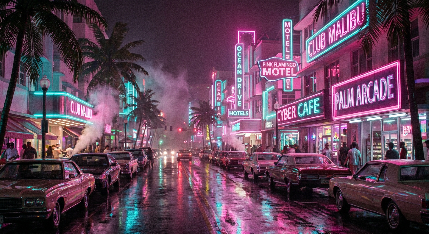
In the night strip sequence, the Ocean View signage is the obvious anchor. What sells the space is everything around it: repeated crosswalk paint, turn-lane arrows that actually align with curb geometry, and a mix of storefront lighting temperatures that makes the street feel like competing businesses rather than one unified set.
Also worth clocking is how much of the frame is functional, not decorative: signal heads, pedestrian buttons, guardrails, and road paint all doing legibility work. It is boring infrastructure detail, and it is exactly the stuff that makes navigation feel intuitive later.
2) Wordmarks you can read
Rockstar’s in-world brands are not just jokes, they are connective tissue. The key is sticking to what is clearly readable in high-quality trailer frames, not what gets invented in compressed reposts or fan upscales.
- Ocean View Hotel is the loudest Vice City callback and it is presented like a real landmark, not an Easter egg tucked into the back of a frame.
- Patriot Beer shows up as clean, unmistakable branding, continuing Rockstar’s long-running “America as a logo” gag.
- In the nightlife corridor material, at least one venue sign appears to read as “NINE1NINE” in cleaner sources, but it is a prime candidate for verification against the highest-quality official upload.
- Another nightlife sign appears to read as “Vice Lights” depending on the source. If you only see it after a repost or upscale, do not treat it as confirmed.
That density of legible commerce is Rockstar telling you what kind of city this is: loud, performative, and built to sell you something. The corridor is not just pretty lighting. It is the economy made visible.
3) Traffic variety, not just volume
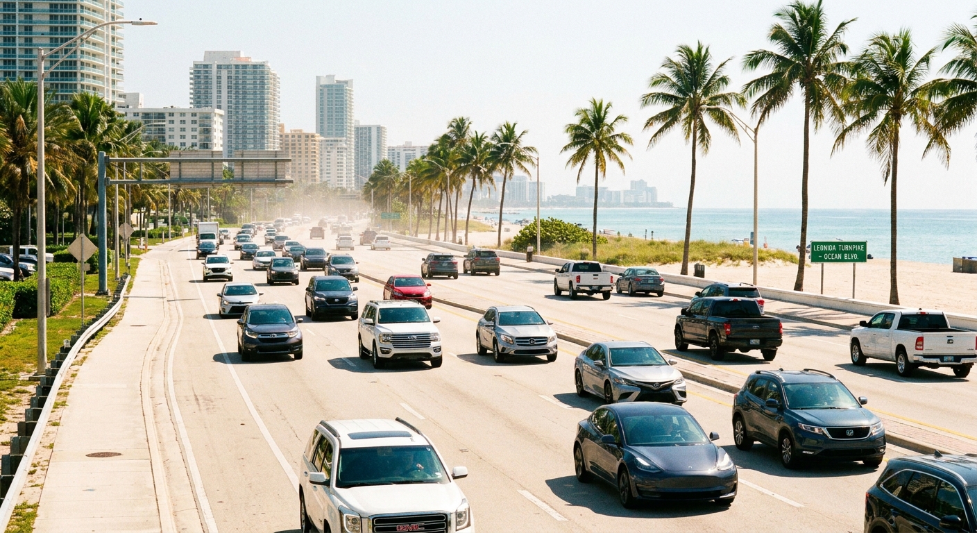
One of the quickest “is this world modern” checks is silhouette variety on the road. In the daytime highway and city-road shots, the spread feels contemporary: compact commuters, chunky crossovers, pickups, and older beaters sharing the same lane space.
There are also a couple of easy signals worth calling out without turning this into a model-name guessing game:
- A wedge-profile supercar shows up as an obvious flex. It resembles the classic Cheetah shape, but without a clear badge or in-game confirmation, treat it as “Cheetah-like” rather than a locked ID.
- Work trucks and older sedans sit alongside newer SUVs in the same sightlines, which is a classic Rockstar move: sell a believable spread of budgets rather than a showroom highway.
It is not simply “more cars,” it is the mix that makes the road feel owned by different people with different reasons to be out.
4) Lighting does the heavy lifting
Rockstar seems to be showing off lighting range across the trailer, because light is the fastest way to make an open world feel cohesive.
- Wet asphalt on the Vice City strip mirrors neon and headlights in a way that can read like recent rain or an actively damp street, without turning everything into a chrome floor.
- Hard overhead daylight in the brighter road shots creates crisp separation between vehicles, road paint, and signage, which helps long sightlines stay readable.
- Mixed-color spill from storefronts and signs paints cars and pedestrians in gradients instead of flat color blocks.
The best tell is consistency: reflective road surfaces behave differently from matte sidewalks, and bright paint lines pop in midday but do not glow unnaturally at night. If materials hold up across totally different moods, the underlying world tech is doing its job.
Outside Vice City
The trailer frames are not just neon and coastline, and that matters for the “state of Leonida” pitch. In the wider non-city cuts, the composition leans into open sky, flatter horizons, and wider road spacing. Even without pinning every shot to a labeled neighborhood, the vibe shift is clear: Vice City is the pressure cooker, and the space outside it looks built for long drives, sprawl, and the kind of encounters that only happen when there is room for things to go wrong.
Three micro-signals do a lot of work here:
- Swamp country cues: low, watery horizons, heavy vegetation, and the sense of roads threading through land that does not want to be developed. That is the kind of terrain where visibility and footing become gameplay texture, not just scenery.
- Suburban edges: wider streets, simpler intersections, and housing sprawl that reads like the city bleeding outward. It suggests the game is not only interested in postcard blocks, but in the in-between places where crimes and routines look different.
- Big-road Florida energy: long straightaways, signage designed for speed, and broad shoulder space that implies room for stops, breakdowns, and roadside chaos.
That contrast matters because it suggests Rockstar is not making one mood and stretching it across a map. The city looks busy by design, and the outlying areas look like they can breathe.
Characters
Lucia up close
In the Lucia street close-up, her frames sell something more grounded than “larger than life.” Her look feels contemporary and practical, and her expression lands as alert and guarded. The camera distance matters too. These are not wide hero shots trying to mythologize her. They are closer, human-scale frames that put her in a lived-in street instead of floating her above it.
The styling details are specific: hoop earrings, layered necklaces, and hair clips that keep her hair controlled in the heat. None of it plays like costume jewelry for a poster. It feels like everyday choices you can run in, sweat in, and forget about until someone sticks a camera in your face. That “regular life” signal pairs nicely with the wider street noise around her.
More importantly, she stays visually clean against busy backgrounds, which hints at a lot of behind-the-scenes work to keep protagonists from getting swallowed by crowd density and signage glare.

Gameplay signals
Crowds look staged but show priorities
Yes, trailer shots can stage crowds. Still, Rockstar tends to reveal priorities through what it chooses to stage. In these frames, the crowd direction looks intentional: believable groupings, varied silhouettes, and plenty of “I was doing something before you showed up” body language.
A recurring modern detail is NPCs with phones out, posed like they are recording, photographing, or scrolling in public. It is small, but it is smart shorthand for a Vice City where the street is part hangout and part feed.
No HUD, and that matters
Another grounded tell is what is not there. The frames are clean, with no visible HUD or on-screen prompts. That does not confirm anything about interface design in motion, but it does underline the marketing goal: Rockstar is asking you to look at street-level readability, not a minimap. When your eye still finds crosswalks, turn lanes, and storefront anchors without UI guidance, it reads like confidence in the world’s visual language.
Street-level details
If you want details that feel less like headline anchors and more like “this is going to play well at ground level,” the trailer is loaded with micro-choices Rockstar usually leans on for immersion:
- Traffic control variety: not just stoplights, but layered street signaling and pedestrian infrastructure that suggests intersections are built to be read quickly while moving.
- Road paint discipline: lane arrows and crosswalk striping are not random decoration. They align with turning lanes and curb shapes in a way that implies real routing.
- Tourist-strip competition: stacked venue signs fight for attention, which is the point. It sells a corridor designed to distract you, and that matters in a game built around temptation.
- Surface contrast: damp roadway reflection versus comparatively drier sidewalks and building faces keeps the night scenes from collapsing into one uniform gloss.
- Background motion: people are framed as if they have errands, conversations, or an ongoing night out, not like they spawned to fill a sidewalk.
These are not splashy feature reveals, but they are the ingredients that decide whether a city feels navigable or merely crowded.
What we cannot tell
Trailer frames still do not settle the big practical questions:
- Performance targets like frame rate and resolution under heavy action
- Platform context such as capture hardware and settings
- System depth including police behavior, NPC schedules, and interior access
Those answers come from extended gameplay and hands-on time, not carefully chosen trailer moments.
What to watch next
If Rockstar keeps releasing footage, the most revealing moments will not be the neon flexes. They will be the boring daylight cuts where nothing cool is happening. Those are the hardest to sell with atmosphere alone. If the world still feels alive when it is not trying to impress you, that is when an open world becomes a place instead of a level.
Until then, enjoy the trailer for what it is: a high-gloss tone reel from a world Rockstar wants you to believe in. The good news is that even in motion, it is packed with readable signals, not just pretty lighting.